Posted on October 11, 2013
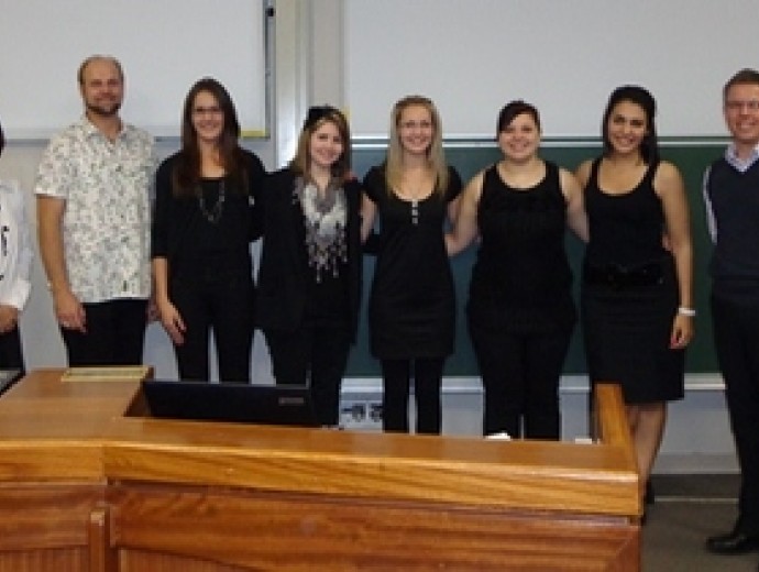
During the lecture, the class was given a mock case study and was challenged to analyse, interpret and present the data effectively. Students had to convince the management team which marketing direction they believe a business should take, based on the results and data analysis. Furthermore, students had to use data visualisation, which is one of the new developments in industry, to present their ideas in a convincing way.
This challenge was more than just that of analysing data. It taught students to base their decisions, advice and suggestions on actual data and justify their recommendation to clients with facts. Students had to find new and innovative ways to present their findings – which was mostly based on numbers and percentages. Dries Noeth explained to the students that, when looking at data, it is essential to view the data holistically and then to make a story out of it. “This specific activity felt like finding water in the desert, because it is so difficult to find exciting ways to present data. At the end it was really rewarding to see that data can be interpreted in more ways than just bar graphs and pie charts”, said Christelda Naidoo, one of the participating students. The students used various creative ways such as infographs, word maps and many other exciting new tools to present their data and to impress Consulta.


Copyright © University of Pretoria 2025. All rights reserved.


 Virtual Campus
Get Social With Us
Download the UP Mobile App